
Help Center Redesign
Web Experience
User Research
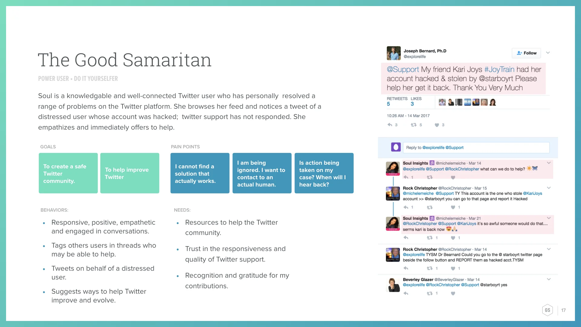
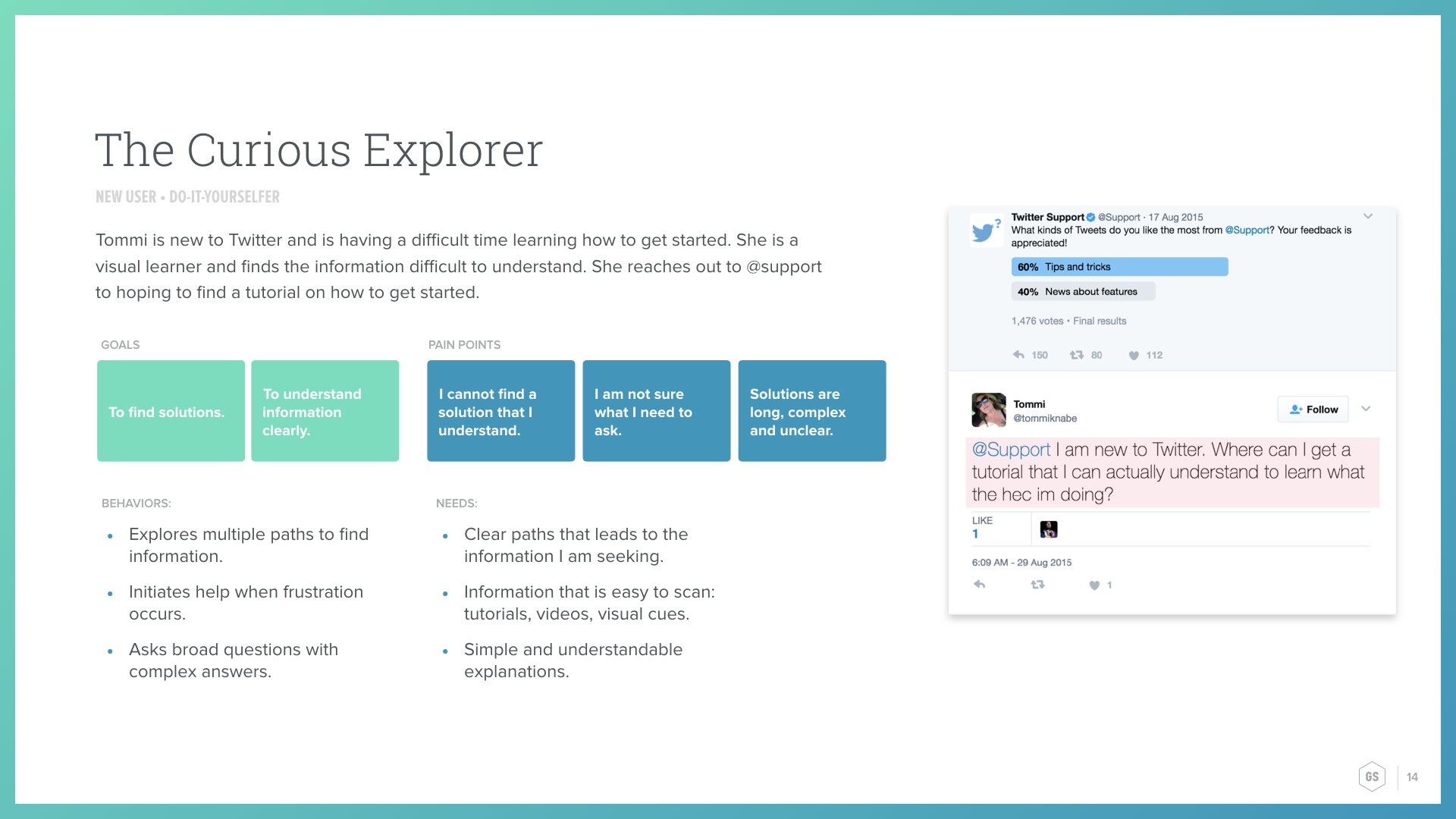
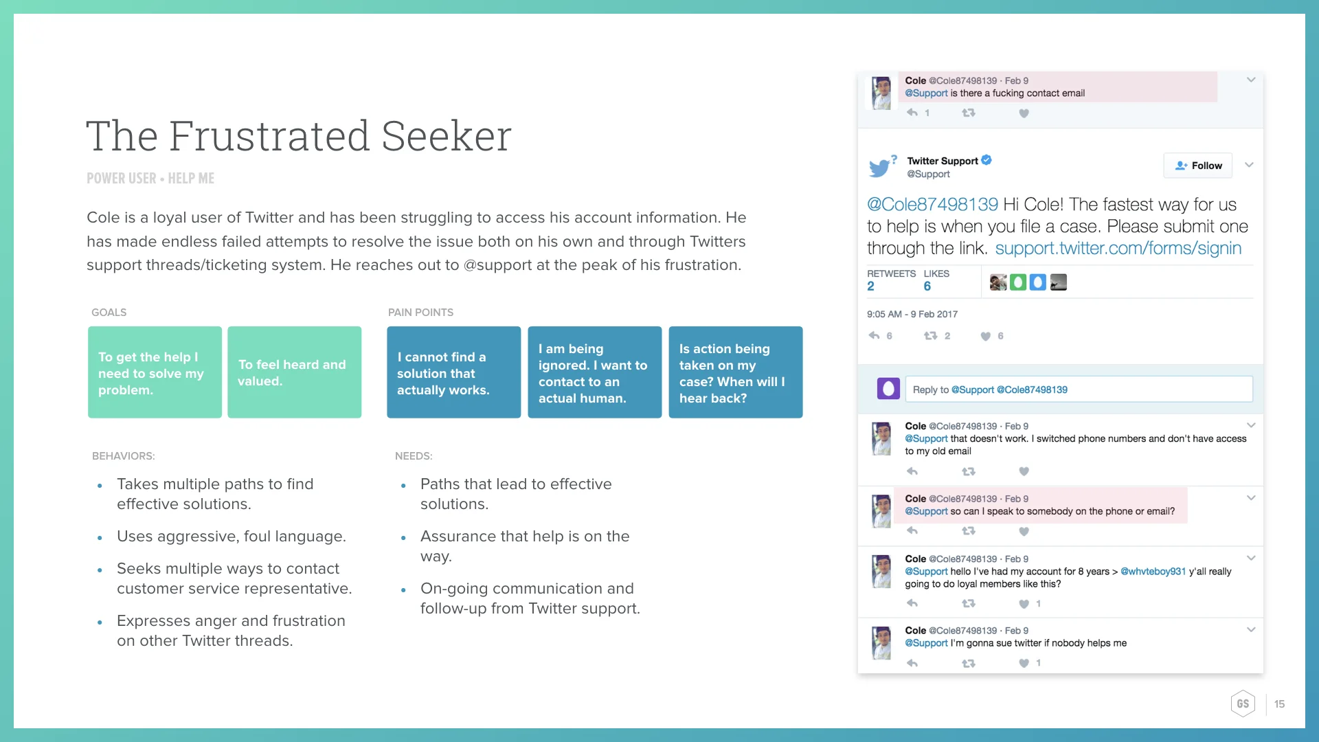
Persona Development
Content Strategy
Taxonomy & Site Map
Navigational Model
UI / Interaction Design
Twitter’s Help Center is visited by tens of millions of people each week looking for help. Many Twitter users were not finding the help they needed and left searching for alternate sources for help. Twitter reached out to us to redesign their help platform.
Our challenge was to help users find the answers they need on Twitter and position Twitter the authority for help content.
Our team consisted of two experience designers, a content strategist, an SEO developer, and two visual designers. We worked collaboratively to deliver functional designs and design systems that improved the accessibility, findability, and readability of help content.
My role in this project focused heavily on user research, content strategy, and information architecture. I developed personas and key usage scenarios based upon user insight. I worked closely with a content strategist to audit, recategorize, rename, and restructure help content to make it easier and faster for users to find the help they needed. I created a new content taxonomy, navigational model, and sitemap for the platform.

Understanding Twitter users.
Where are users going when they are looking for help? What devices are they on? When do they prefer self-help options? When do they prefer to speak to someone?
Our team had a wealth of user insights to draw from through Tweets from people reaching out to Twitter for help. We synthesized these Twitter conversations into 4 behavioral personas. We found that their behaviors and where they expected to get help from varied depending on the type of issue they were trying to resolve. And surprisingly, many Twitter users would spontaneously assist others who were unsure of where to get help from.

Creating help where you need it, and
when you need it.
Our vision was to build a smarter Help Center no matter where users were. Help content needed to be surfaced as snippets in Google Search, help content needed to be more accessible from within Twitter’s product, and help content needed to shareable between Twitter users looking to assist one another.
We brought that to life through Help Cards, instructional help content that would not only live within the Help Center in help articles and through the site search, but could be modularized to be search engine friendly for Google Snippets, and could be contextual and shareable within the product.
Improving the findability of help articles.
Modernizing the design alone was not going to improve how Twitter’s Help Center was ranking in search results or improve the path that user needed to take to find the right help article.
We recategorized all the articles within the Help Center to make it easier to find the right category and article, as well as reduce the number of clicks required. We renamed articles and introduced consistency to make it easier to scan through and find the right article. We restructured the URLs of all pages within the Help Center to improve the site search as well as improving search rankings.
Constructing a readable & flexible design system.
Throughout the creative process, we balanced our design decisions with the needs of the users and the requirements of business. Our use of type and color modernized the Help Center. We chose to bold keywords to improve the ability for Twitter users to scan through Twitter’s catalog of 300 articles. We intentionally avoided graphic elements to build efficiencies for content managers translating content, as well as to reduce page load for users with limited bandwidth. Our approach to design was thoughtful and conveyed a Twitter’s voice: simple, direct and empowering, while fuling the needs of the user: findability, readability and speed.
Validating our designs.
Throughout our design process, we tested prototypes of the Help Center to inform us of the behaviors and expectations of Twitter users who have experienced technical issues as well as harassment and abuse on Twitter in the past. These insights proved invaluable in our iteration process, and reassured both our team and Twitter that the improvements we were making would make a difference in how Twitter users experience the Help Center.
Wrapping up the project.
All together, we’re confident that improvements in architecture, content and the new design will Twitter users find help users find help they need from where they need it. Our clients seemed to think so as well:
"I’ve been impressed with how focused the team has been on hitting our milestones while simultaneously maintaining flexibility to allow us to make adjustments to our process and plans along the way. I also appreciate their transparency, as it's helped reinforce that this project is a collaboration, which I believe will better position us for success." -Twitter Clients